Building trust through consistency.
Welcome to the Wy Co Brand Guidelines. We focus on empowering small businesses and multi-branch operations in the GCC and Kerala with cohesive, professional IT identities and solutions.
Primary Font
Just Sans
Primary Color
#2E3192
Icon Style
Lucide React
Corner Radius
8px (0.5rem)
Our Mission
Leading the digital transformation for local businesses in the GCC and Kerala, one branch at a time.
Our Vision
To be the global leader in digital transformation, bridging the gap between technology and business growth.
Integrity
Transparent and ethical partnerships.
Innovation
Constant evolution of our tech.
Our Logo
The Wy Co logo symbolizes focus and definition. The squared brackets represent the technical precision of our code and the framing of our clients' success.

Inverted / Dark Mode
Maintain a minimum clear space of 'x' (height of the 'W') on all sides to ensure legibility.
Minimum Size
Digital: 24px Height
Icon: 16px Height
Ensure the logo is never smaller than these dimensions to maintain legibility across devices.
Partnership Lockup
Use a vertical hairlines (`slate-300`) to separate the Wy Co logo from partner logos. Ensure equal height alignment.
Use on clean, solid backgrounds.
Do not stretch, rotate, or distort.
Use white logo on dark backgrounds.
Do not use low contrast combinations.
Color Palette
Our color palette is anchored by Wy Co Blue, representing reliability and intelligence. We use a neutral scale for structure and hierarchy, ensuring our content remains the focus.
Primary Brand Colors
#2E3192#0F172A#F8FAFC#EFF6FFNeutral Scale
Functional & Status Colors
Semantic colors used to communicate status, errors, and success states. These should be used sparingly to maintain the clean, professional aesthetic.
Typography
We use Just Sans for all digital touchpoints. It is a modern geometric sans-serif that embodies our technical precision and forward-thinking value.
Just Sans
Modern Geometric
| Style | Specs | Example |
|---|---|---|
| Display 1 | 60px (3.75rem) Bold (700) Tight (-0.02em) | Innovative |
| Heading 1 | 48px (3rem) Bold (700) Tight (-0.01em) | Enterprise Growth |
| Heading 2 | 36px (2.25rem) Bold (700) Normal | Digital Solutions |
| Heading 3 | 24px (1.5rem) Semibold (600) Normal | System Architecture |
| Body Large | 18px (1.125rem) Regular (400) Relaxed | We build systems that scale with your business needs. |
| Body Base | 16px (1rem) Regular (400) Relaxed | Standard text used for paragraphs and general reading content across the platform. |
Voice & Tone
Our voice is professional, confident, and forward-thinking. We speak with the authority of experts and the approachability of partners.
Professional
We use clear, precise language. Avoid slang or overly casual expressions. We are experts in our field.
Empowering
Our content should make our clients feel capable and ready for growth. We provide tools, not just services.
Visionary
We look ahead. We discuss trends and the future of IT, positioning Wy Co as a pioneer.
Iconography
We Use Lucide React for our iconography. Icons should be clear, minimalist, and consistently weighted at 2px to match our professional aesthetic.
Shadows & Depth
We use subtle shadows to create depth and hierarchy. For dark mode, we transition from shadows to subtle borders and glows to maintain structure without muddiness.
Level 1 (Subtle)
Used for cards and standard containers.
Level 2 (Elevated)
Used for dropdowns and interactive elements.
Level 3 (High)
Used for floating buttons and modals.
Accessibility (WCAG)
Accessibility is a requirement, not a feature. We ensure standard contrast ratios are met for legibility across both themes.
Text Contrast
Critical Rules
- Never use
text-primaryon a dark background unless it is large scale (Heading 1 or above). - Do not rely on color alone to convey meaning; always use icons or text labels.
- All interactive elements must have a high-contrast focus ring.
- Minimum touch target size is 44x44px for inclusive mobile experiences.
Grid & Layout
We utilize a flexible 12-column grid system with balanced white space to create clean, readable layouts across all device sizes.
Spacing System
Base unit: 4px. Use consistent increments (8px, 16px, 24px, 32px) for structural hierarchy.
Maximum Width
Our main content container max-width is 1280px (7xl), centered with responsive horizontal padding.
Photography & Imagery
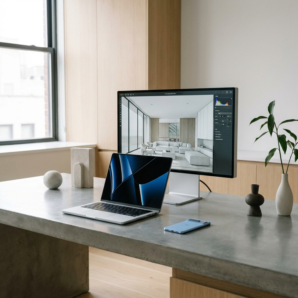
Our imagery reflects the intersection of humanity and technology. We prefer authentic, candid shots of people collaborating in modern, clean environments.
Style Guidelines
- Focus on natural lighting and shallow depth of field.
- Incorporate "Wy Co Blue" through subtle environmental accents or clean digital overlays.
- Avoid stiff, obviously staged corporate stock photography.
- Show technology in real-world use cases, integrated into work-life balance.


UI Components
Our interface is built on a foundation of modular components. We use glassmorphism for technical depth and clean, responsive elements for day-to-day interactions.
Technical Badges
Our signature `BrandBadge` component. Designed for technical markers, certifications, and industry benchmarks.
Dark Glassmorphism
Default variant. Use on dark backgrounds (#0F172A or similar) to achieve the premium glass effect with subtle inner glow.
Light Minimalist
Secondary variant. Use on pure white or light gray surfaces where high contrast and brand visibility are prioritized.
Interaction Elements
Buttons
Input Fields
Status & Tables
| Service | Uptime |
|---|---|
| Cloud API | 99.99% |
| Auth Service | 100% |